Temple Israel
Nonprofit / Religious Institution Branding
Branding, Visual Identity, Design Research
Industry vvv.
Expertise
Heritage, brought into focus. A renewed visual language defines a legacy institution’s role as a contemporary and inclusive congregation.
The Challenge: Temple Israel needed a renewed visual identity that could better reflect its role as a progressive, inclusive, and evolving congregation. The existing brand felt outdated and lacked alignment with the institution’s values, messaging, and contemporary presence.
Methods: Grounded in conversations with clergy and staff, the process began with research into Temple Israel’s history, cultural significance, and long-term vision. From there, I developed and refined a series of logo explorations, typographic directions, and color studies, ultimately extending the identity across a range of physical and digital touchpoints.
The Outcome: The final identity system reinterprets the Star of David through a more contemporary and cohesive visual language, balancing heritage with modernity. Through geometric repetition, refined typography, and a restrained color palette, the brand expression communicates unity, clarity, and forward momentum. The result is an identity that feels both rooted and current, better reflecting Temple Israel’s role as a welcoming and future-oriented institution.
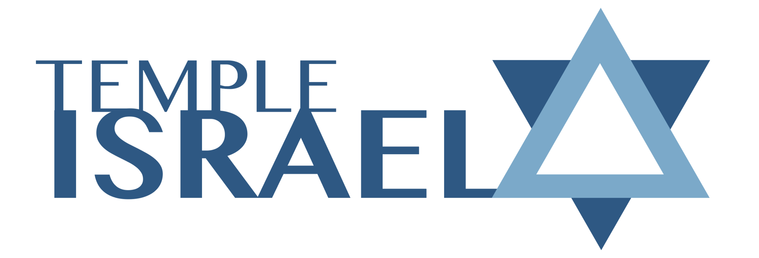
LOGO DESIGN
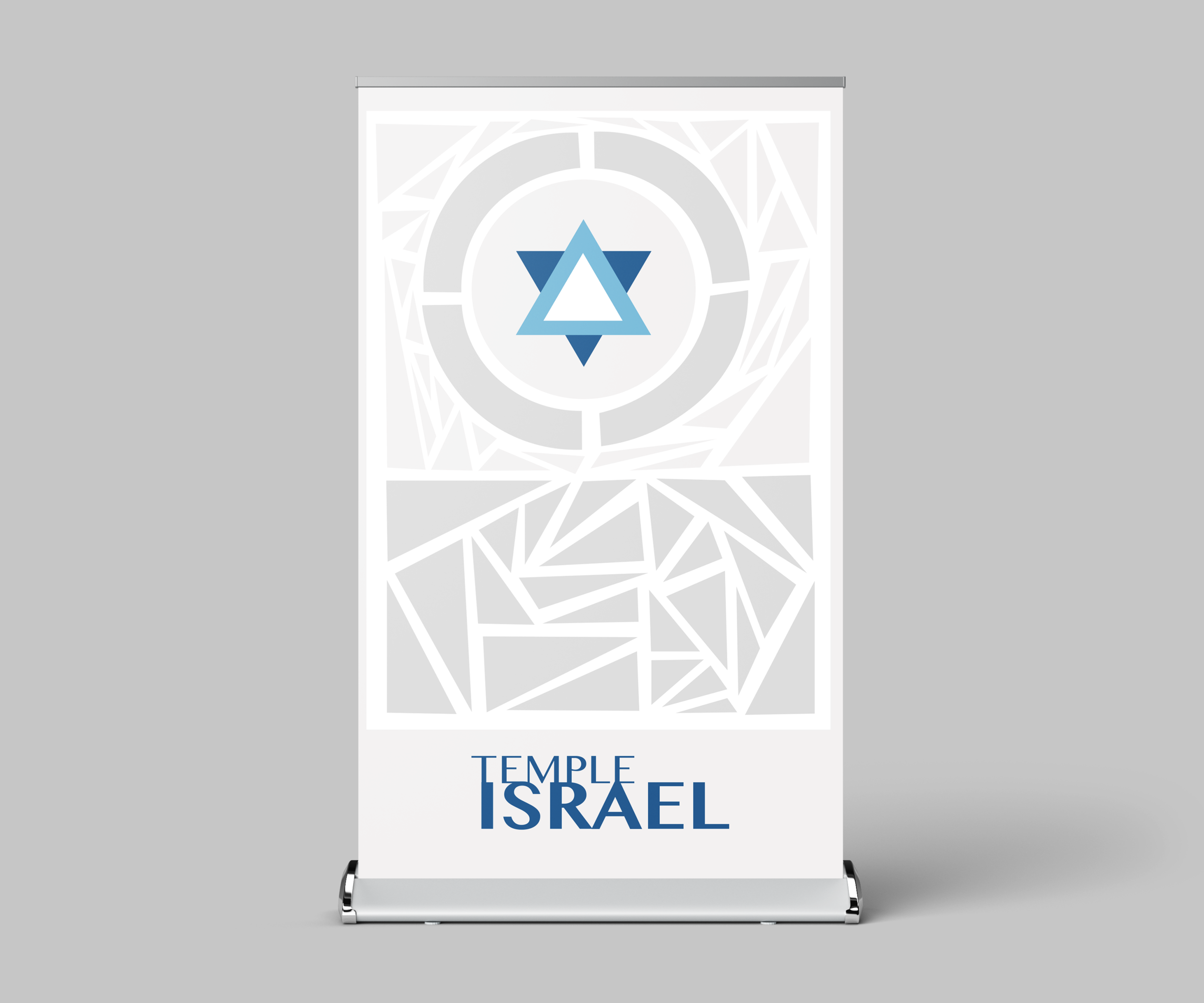
I decided to connect all of the elements in the logo - both words and the Star of David symbol - in order to represent the interconnectedness of each member within the congregation and the sense of community created by Temple Israel. Furthermore, the negative space created between the text and symbol creates an arrow-like form, representing how Temple Israel is always moving forward and constantly evolving. While the modernity present in this logo is a departure from Temple Israel’s old version, I kept a similar blue and white color theme in order to allow for change without completely abandoning the history and heritage of Temple Israel. Finally, I created a series of repeating triangle forms that mirror each other in both the Star of David symbol and the letterforms to create a sense of unity and balance.

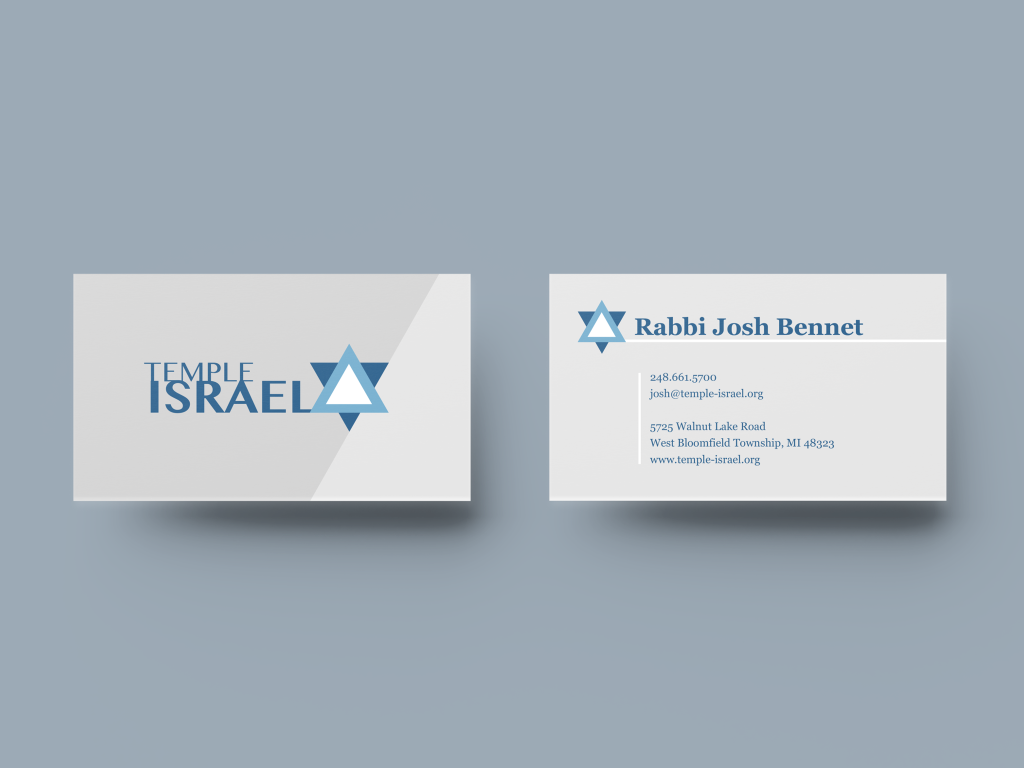
BRAND APPLICATIONS


POSTERS
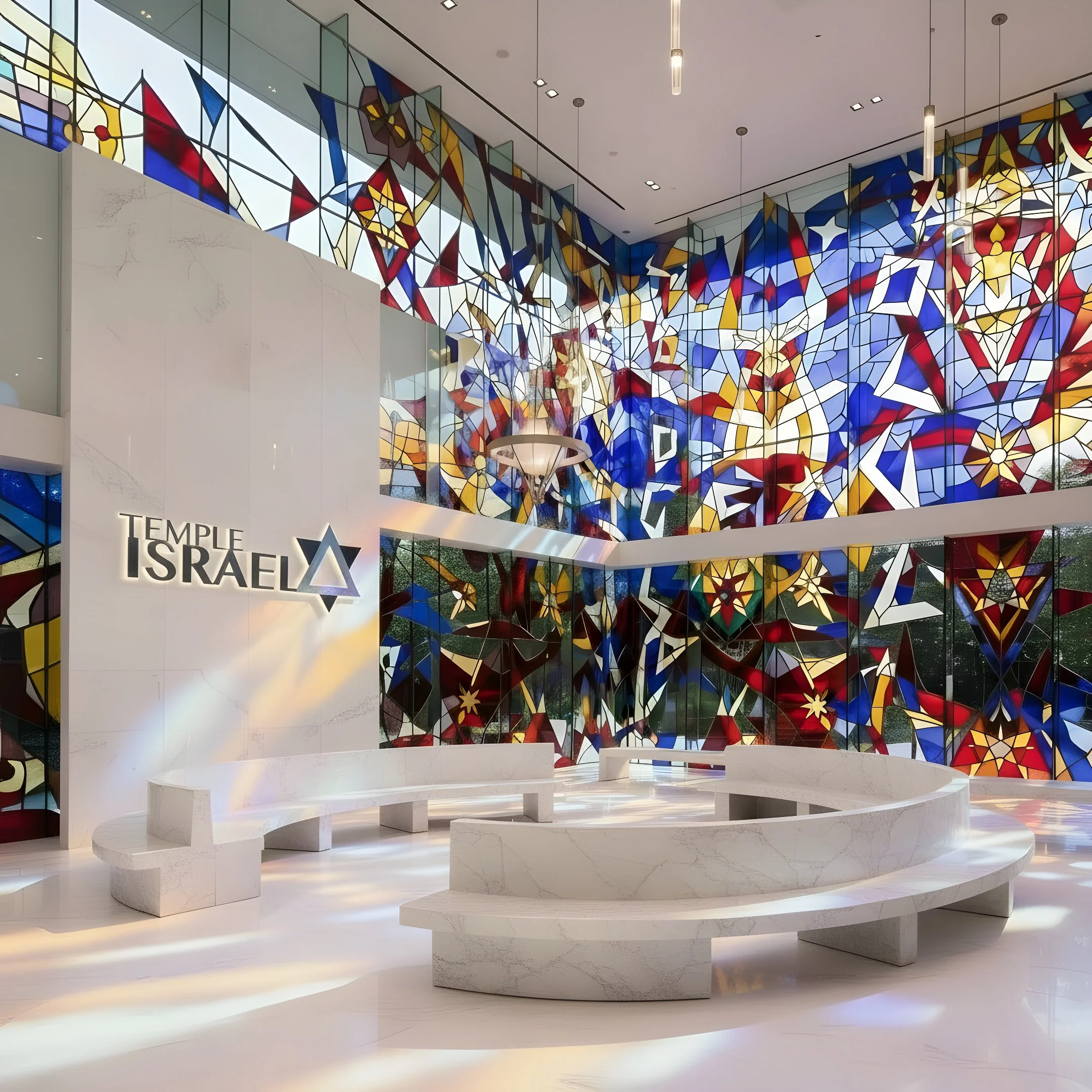
I began by focusing on the triangle shapes present in the logo to experiment with repeating shapes to create a mosaic-inspired pattern. I wanted to represent the idea that despite all the triangles being different sizes, colors, and orientations, they all fit together to create a cohesive whole, just as the members of Temple Israel come together within the congregation to form a welcoming and diverse community.


MERCHANDISE


SIGNAGE


CLOSING
Throughout this design process, I was truly able to develop a deep understanding of the history, ethos, and future goals of Temple Israel. Temple Israel is a congregation that strives to make a difference, that prides itself on diversity, community, and inclusivity. It is critical for the Temple’s brand identity to measure equally in excellence to the Temple itself in order to be able to foster the community and draw in more people to the congregation.