Evil Twin Brewing
Food & Beverage
Brand Strategy, Packaging Design, Voice & Narrative Development
Industry
Expertise
In a category defined by constant novelty, experimentation has become a defining force. The opportunity lies in translating that energy into a cohesive and recognizable expression that builds clarity and drives recognition.
The Challenge: Define a forward-looking packaging identity for Evil Twin Brewing that meaningfully evolves the brand’s visual language while preserving its core ethos. The objective was to expand the boundaries of the existing system without diluting the brand’s distinctiveness or cultural credibility.
Methods: Conducted a multi-layered brand and market analysis, including an audit of brand history, values, and architecture, alongside a competitive landscape assessment. This was complemented by future-facing trend forecasting within the craft beer category to identify emerging shifts in consumer behavior, aesthetics, and positioning. Insights were synthesized into a refined target audience framework and strategic opportunity areas for differentiation.
The Outcome: Developed a cohesive identity system that translates Evil Twin’s principles of experimentation, eccentricity, and boundary-pushing creativity into a scalable visual language. The system strengthens brand presence while enabling greater consistency across touchpoints, positioning the brand for continued cultural relevance and distinction within an increasingly saturated market.
OVERVIEW
BACKGROUND
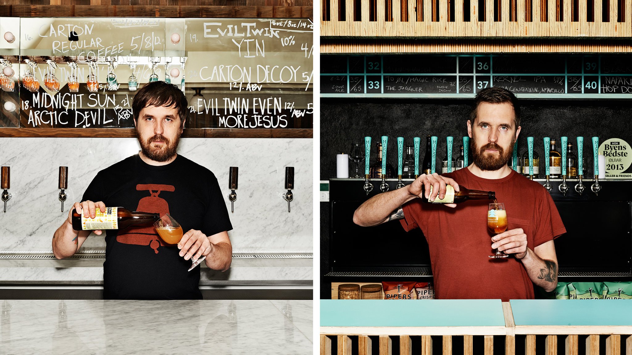
Jeppe Jarnit-Bjergsø, pictured left, and his brother, Mikkel Borg Bjergsø, are identical twins from Niva, Denmark. The twins, while close growing up, are now estranged. They haven’t spoken since 2010, when Jeppe launched Evil Twin Brewery, which would rival his brother’s Mikkeler Brewery. Both brothers have remained fiercely competitive throughout the years, and have each become titans in the beer world.
Evil Twin Brewing is an extraordinary craft brewery and taproom based in Ridgewood, Queens, New York. It has produced almost 100 beers and sells its products worldwide. It functioned “nomadically” until Jeppe established the permanent location in New York in 2016. Evil Twin is an innovative local microbrewery, known for its boundary pushing creative flavors, bold combinations, and trusty classics.
LOCATION
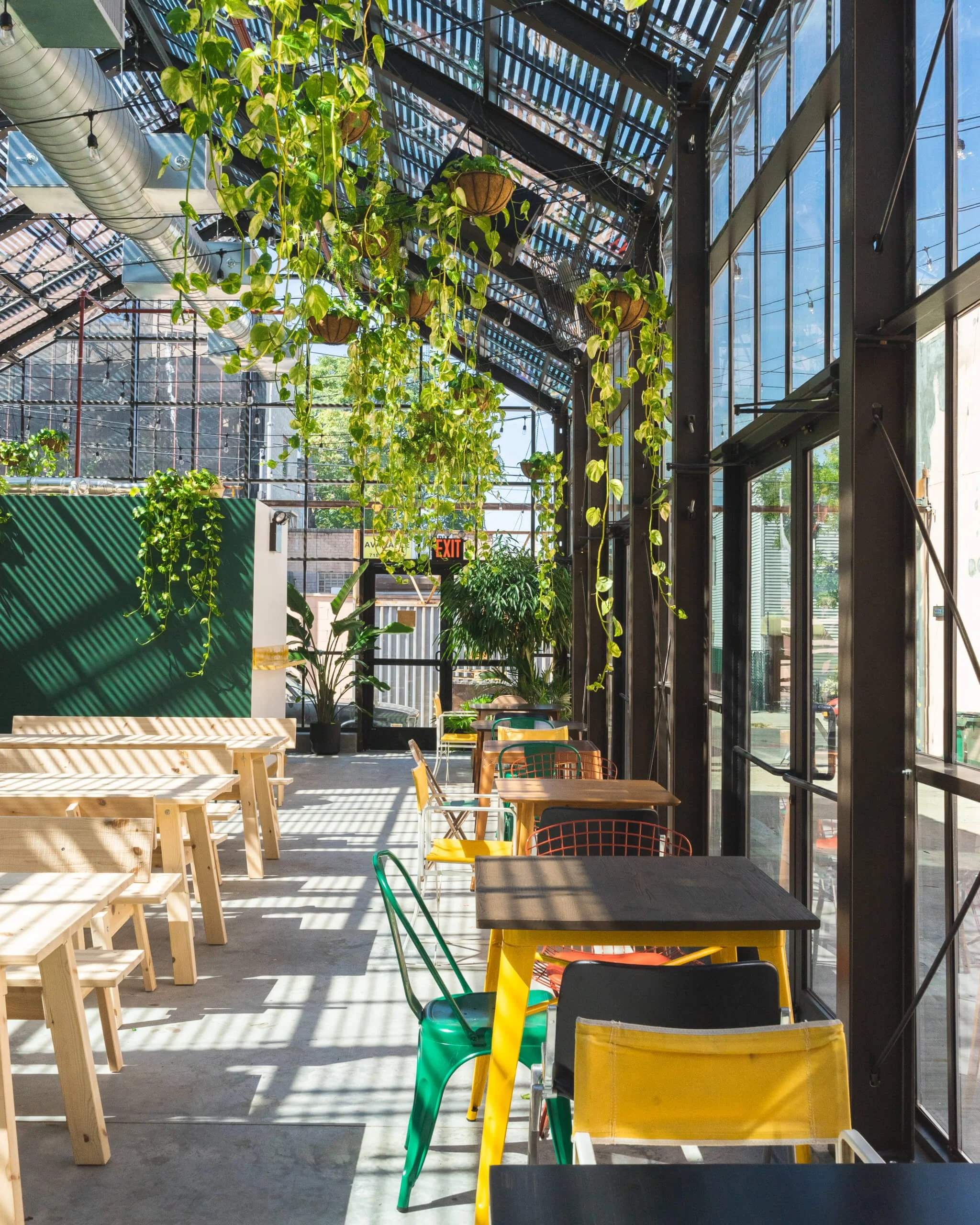
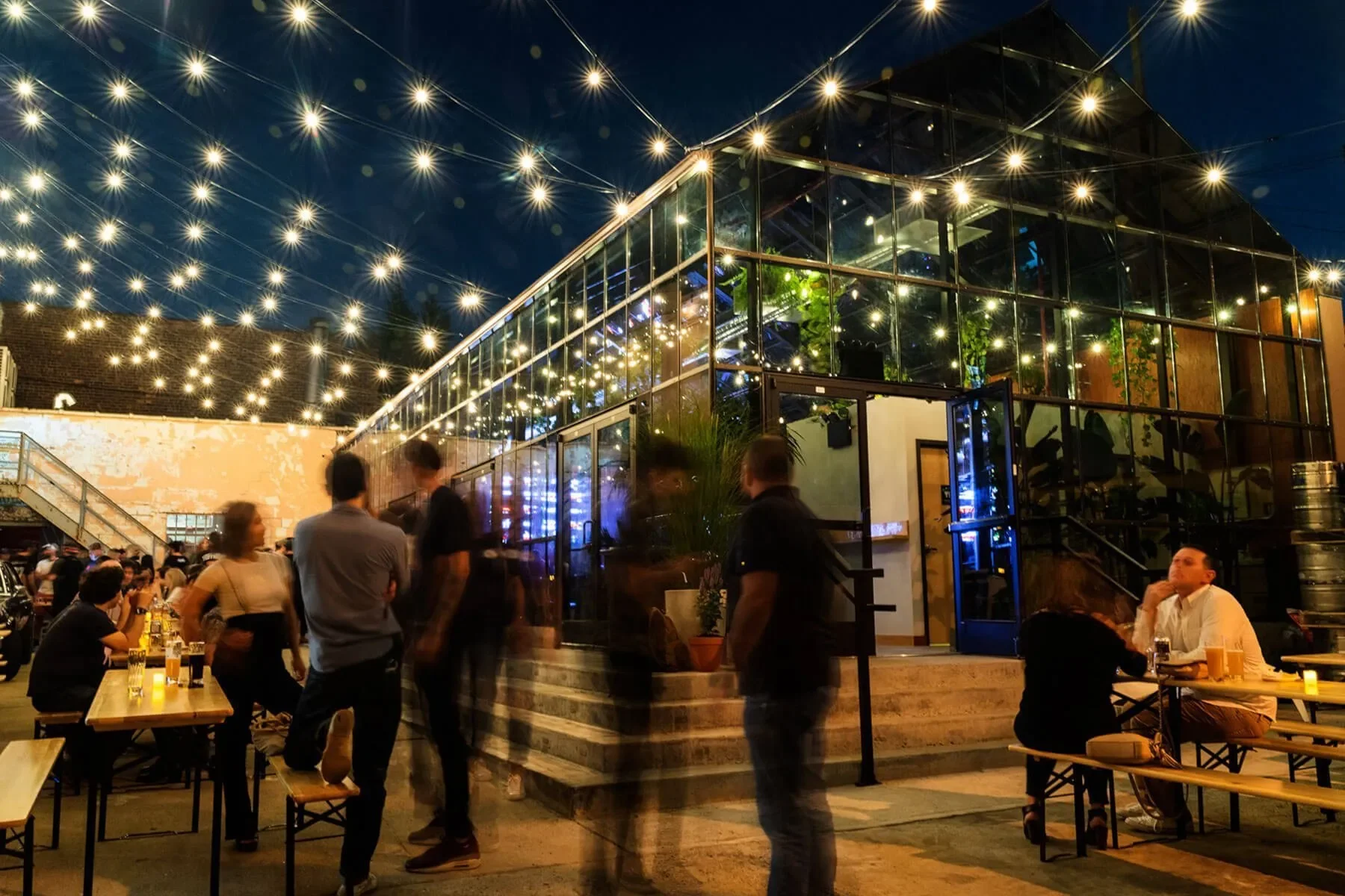
Evil Twin Brewing NYC is located inside a greenhouse designed by designed by architecture firm Kushner Studios. The interior can hold 75 people on stools and wooden picnic tables surrounded by glass and hanging plants, and the outdoor patio can hold 185 people. The location will also feature food trucks, live music, movie screenings, a coffee shop, and soon a cocktail bar. Jeppe wanted the space to be “not only beer nerds sitting here sniffing their beer,” but a casual hangout for a broader clientele where “everyone can come and want to spend money because it’s a cool place to hang”.
With the exception of the architecture, everything within the space was designed by Jeppe and his wife Maria- from the layout and design to the lighting and decor. They wanted to be able to say that it was 100% their place. The intentionality in the design is evident. Jeppe declared, “we want it to be our place, we want it to be exactly how we imagine it”.
CEO
With Evil Twin Brewing NYC, Jeppe set out to make the best beer possible, to change the New York beer scene, and to “show the world that beer can do a lot that has not been done before”.
Jeppe runs his business with a close-knit, collaborative team, closer to a family than a corporate ladder. His mindset is straightforward- that beer is meant to taste good. He treats his brewery like a kitchen, and the results are paying off.

“People ask, what do you consider yourself? An artist? A chemist? No, I consider myself a cook.”
CONSUMER PROFILE

Jeff is your stereotypical “beer nerd” from Denver, Colorado, who loves finding the best new beers and is picky about what he drinks. He had a brief stint with attempting to make his own beer but now leaves it up to the professionals. Jeff is a regular at Evil Twin and is always first in line to try the new launches. He is rugged and outdoorsy, and always makes sure to pack a couple beers after a long day on the slopes.
Hayes has spent the past three years since graduating college working in finance in NYC. He lives in a Brooklyn loft apartment and has a considerable amount of disposable income. He enjoys exploring the food and art scene of the city and is intentional about his purchases. When the weather gets nice in the Spring, Hayes and his boys will bike between the breweries in Queens, making sure to check in their beers on Untapped.
Robin is a born and bred NYC local. She grew up in Queens, where she still lives with her adopted doberman. Robin heard about the opening of Evil Twin from her neighbor and went to check it out. Now she can often be found enjoying the sun on the Evil Twin patio with her dog and a craft beer in one hand and book in the other.
CURRENT CMF

The current visual landscape of Evil Twin Brewing is expansive but largely unstructured, with a wide range of color palettes and graphic expressions that lack a cohesive system. While this variability reflects the brand’s experimental ethos, it results in limited consistency and weakens overall brand recognition.
Across the portfolio, the primary point of continuity is a standardized rectangular label format with white margins at the top and bottom, paired with a minimal sans serif wordmark positioned at the base. Notably, the absence of a consistent, front-facing brand identifier further diffuses recognition, limiting the brand’s ability to build a strong and immediately legible presence.
DESIGN PROCESS

The existing logo for Evil Twin Brewing presented an opportunity for refinement. While visually bold, it leaned toward an aggressive expression that felt misaligned with the broader brand and lacked distinctiveness within the category.
The devil horn detail embedded within the “V” was conceptually interesting but under-articulated, resulting in low legibility and ambiguous meaning. As a result, the gesture felt incidental rather than intentional, diminishing its effectiveness as a defining brand element.
SKETCHES


LOGO & GUIDELINES

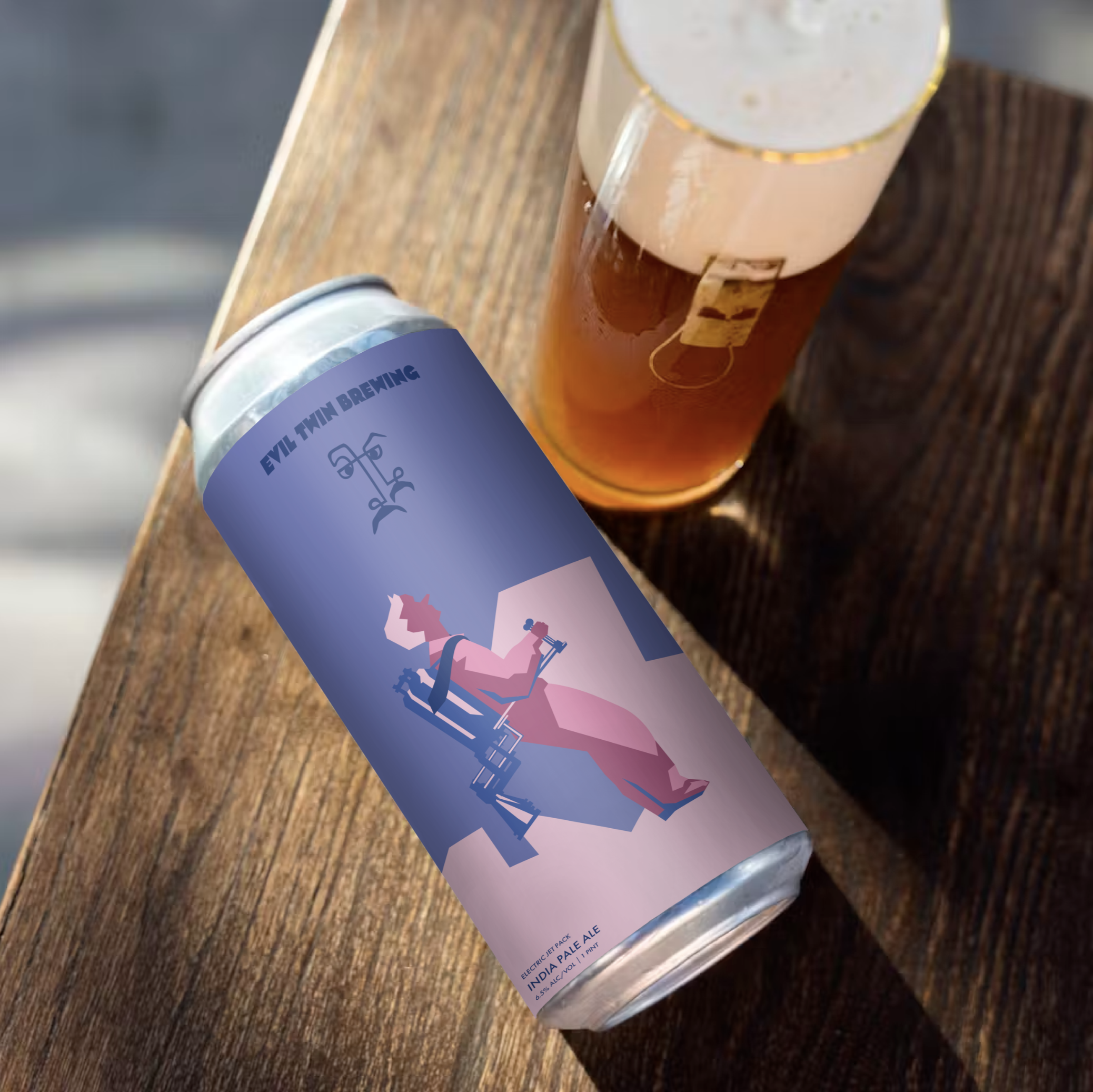
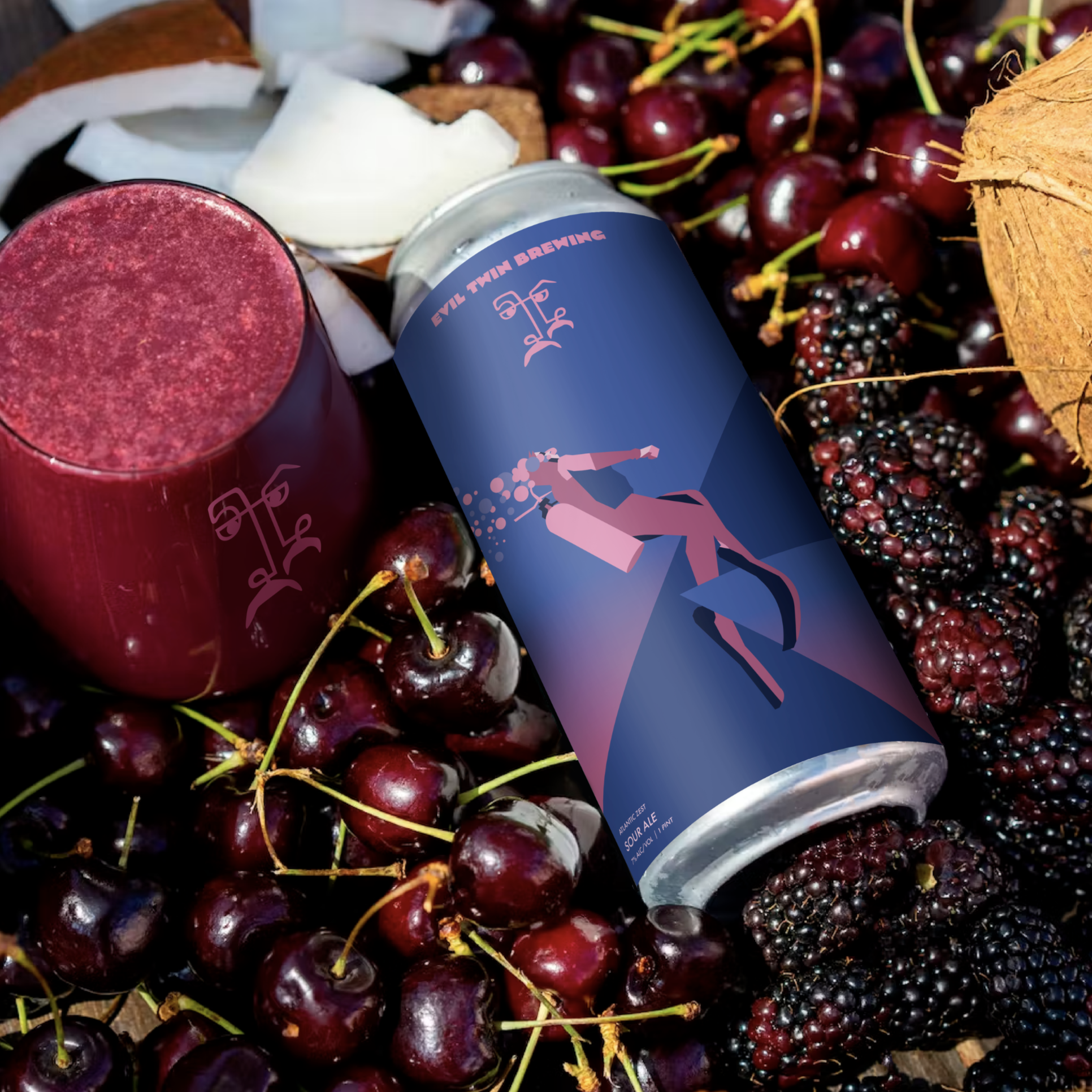
The logomark is built around a dual-face motif, capturing two profiles simultaneously facing each other and outward. This directly references the founders’ twin dynamic, translating a core element of Evil Twin Brewing’s narrative into a distinctive and ownable visual asset. Bold mustache forms anchor the mark, reinforcing recognizability and giving it a clear, character-driven identity.
Following the development of the symbol, the logotype was explored through a series of typographic studies to identify a configuration that felt both bold and characterful without competing with the mark. The final system balances clarity with personality, ensuring flexibility across applications.
Importantly, the logo was designed to function as a consistent, front-facing identifier across packaging. Introducing a clear brand mark on the front of the can addresses a key gap in the existing system and strengthening recognition.

LABEL DESIGN